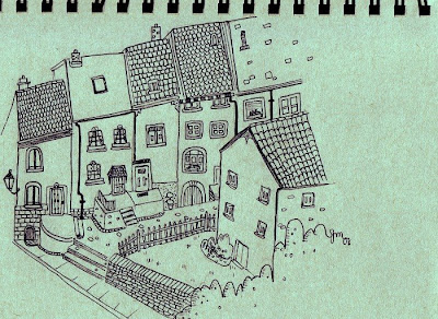
Drawing for this week's Illustration Friday - the word is "packed". Thus, houses packed together. Coincidentally, I drew this today, then realized it fit the theme for this week.
Also, some quick scrawlings of archways:

Also, some quick scrawlings of archways:

I love design and I love to create; I have no formal training whatsoever in the visual arts, and I sometimes feel doomed because of that, but I try make do with what little I know. My interests are always changing, but right now I'm enjoying children's book illustration, YA fiction, interior design, television on dvd, baking, science fiction, documentaries, healthy living, and riding my bicycle. Interior decorating/design files: ceilingexplorer.tumblr.com
15 comments:
Nice drawing- has a confidence to it.
like the arch ways a lot. really nice work. is your sketch pad green or is that just my monitor ;p?
michael: a little bit in between those two options, actually! The sketchpad I used was oatmeal-coloured, but I digitally changed it, as I thought the mint green added a nicer effect. :)
Joyful, springing line work, Lovely feel for pattern. I will loook at more of your work, as long as I'm here...
lovely!
Cool line work!
http://indigeneartforms.blogspot.com
Very nice work!
your style, really nice linework.
the little details really make it
These drawings lift my heart!
Beee-yoooooo-tiful! I love architectural art, and I love your free flowing lines. They are awesome!
Dig your style. This little village is full of story...
i love all the detail and the line work
Great work. The detail is naive but just right. A magical series.
You should Totally do illustrations for Children's books!!
I love your style! :D
i really Luv ur style~
simple, cute - brilliant!
Post a Comment